Brand foundation · v6 “Gallery” · October 2026
The system, in real pixels.
Every token in app/globals.css, rendered rather than described. Gallery is white and ink, a quiet grey, one lime accent, one family — Geist — rounded panels and pill actions, and one marker line for the hand. Ink leads and lime marks what matters; the templates bring the rest of the colour. If a colour, size or radius is not on this page, it does not exist in the system.
Wordmark
C1Sena, written in one even marker line, leaning 10°. It is drawn, not typeset: one pen, round at every end, the same weight all the way through. It takes the text colour, so it is ink on light and white on dark, and nothing about it is ever tinted.
Do — The word in the navigation, the footer and on share cards. The tile, the word's own s, where the word will not fit: the favicon, the home-screen icon and the Google sign-in screen.
Don’t — The name retyped in a script font, the mark tinted, or the tile's s swapped for a letter from a typeface.
Hand layer
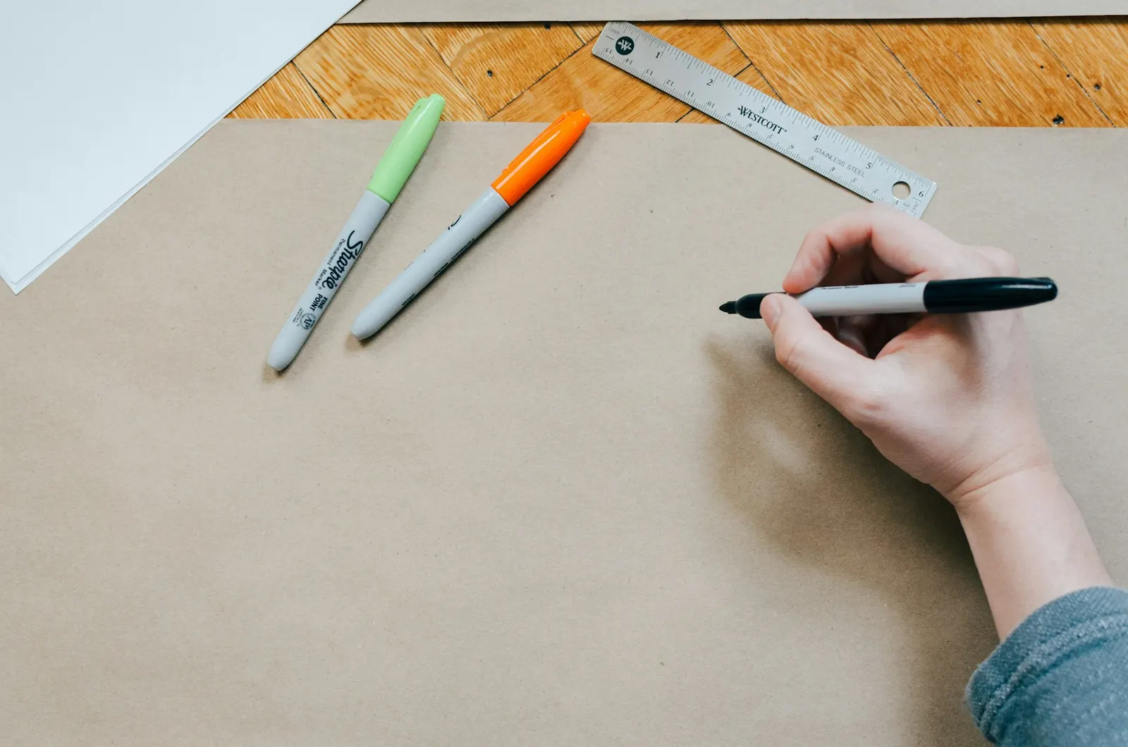
Brand bookPicked by hand (13 October 2026). The exact layer is everything above and below: Geist, the grid, tiles and ink pills. The hand layer is one marker line, the logo's pen: it writes the name, and in a curator's hand it circles, ticks and points at what matters. One mark per composition.
The whole book
Colour
C3Ink, white, three greys and one accent. The action is ink — a black pill on white, a white one on dark. Lime, #DBF865, is the accent (adopted 13 October 2026): a fill with ink on it that marks what you chose, what is new and what is done, never type, one lime band per page. The label hues mark a state and never an action.
Semantic tokens
What components use. Each has a light and a dark value; the markup never says which.
The greys, and what each is for
Label scale
A hue that says rather than does: a badge, a status dot, a line of meta. Two tokens per hue — the fill and the type on it — because a tint that works on light is invisible on dark.
lime — A state — live, passed, new. Never an action.
lavender — People and craft — the maker, the story.
cobalt — Data and proof — stacks, counts, test results.
Ink does. The templates speak.
The interface carries no colour of its own, so the only colour on a page is the templates’: their screenshots, their palettes. A coloured button or a tinted band would compete with the thing being sold.
The label hues never touch a control. A green button would read as “passed”, not “press”.
Contrast
D1Measured, not assumed. Every pair the system renders, computed from the tokens on every render. AA is 4.5:1 for text and 3:1 for interface parts; a failure would show here before it shipped.
Light mode
all 14 pairs pass| Aa | --text on --bg | Body copy | 19.67:1 | AA 4.5 |
| Aa | --text-muted on --bg | Meta, hints | 5.62:1 | AA 4.5 |
| Aa | --text-muted on --plate | Panel captions | 5.11:1 | AA 4.5 |
| Aa | --text-muted on the grey band | The template grid, a quiet band | 5.20:1 | AA 4.5 |
| Aa | --on-accent on --accent | Primary button | 19.67:1 | AA 4.5 |
| Aa | --on-accent on --accent-hover | Button hover | 14.12:1 | AA 4.5 |
| Aa | --link on --bg | Inline links | 19.67:1 | AA 4.5 |
| Aa | lime strong on lime soft | Lime badge | 4.81:1 | AA 4.5 |
| Aa | lavender strong on lavender soft | Lavender badge | 6.28:1 | AA 4.5 |
| Aa | cobalt strong on cobalt soft | Cobalt badge | 6.36:1 | AA 4.5 |
| Aa | --danger on --surface | Field error | 6.15:1 | AA 4.5 |
| Aa | --danger on --danger-soft | Notice — error icon | 5.27:1 | AA 4.5 |
| Aa | --text on --danger-soft | Notice — error copy | 16.87:1 | AA 4.5 |
| Aa | --border on --bg | Hairlines (decorative) | 1.25:1 | n/a |
Dark mode
all 14 pairs pass| Aa | --text on --bg | Body copy | 17.00:1 | AA 4.5 |
| Aa | --text-muted on --bg | Meta, hints | 6.85:1 | AA 4.5 |
| Aa | --text-muted on --surface | Card meta | 5.73:1 | AA 4.5 |
| Aa | --text-muted on --plate | Panel captions | 6.16:1 | AA 4.5 |
| Aa | --text-muted on the grey band | The template grid, a quiet band | 6.29:1 | AA 4.5 |
| Aa | --on-accent on --accent | Primary button | 17.98:1 | AA 4.5 |
| Aa | --link on --bg | Inline links | 17.00:1 | AA 4.5 |
| Aa | lime strong on lime soft | Lime badge | 8.56:1 | AA 4.5 |
| Aa | lavender strong on lavender soft | Lavender badge | 7.99:1 | AA 4.5 |
| Aa | cobalt strong on cobalt soft | Cobalt badge | 7.43:1 | AA 4.5 |
| Aa | --danger on --surface | Field error | 6.64:1 | AA 4.5 |
| Aa | --danger on --danger-soft | Notice — error icon | 6.99:1 | AA 4.5 |
| Aa | --text on --danger-soft | Notice — error copy | 14.98:1 | AA 4.5 |
| Aa | --border on --bg | Hairlines (decorative) | 1.43:1 | n/a |
tone-ink (both modes)
all 4 pairs pass| Aa | --text on tone-ink | Body copy | 17.00:1 | AA 4.5 |
| Aa | --text-muted on tone-ink | Meta | 6.85:1 | AA 4.5 |
| Aa | --text on --surface | Panel copy | 14.23:1 | AA 4.5 |
| Aa | --on-accent on --accent | Primary button | 17.98:1 | AA 4.5 |
Where Gallery runs closest
Muted type on the plate grey is the tightest common pair, at about 5.1:1 — which is why captions on a plate are never lighter than --text-muted.
The green badge is the tightest label, at about 4.8:1 on its own fill.
Type
C2One family, Geist. Display sizes are set tight and large, everything below them calm. The top three steps are fluid: the size at a 1440px screen, shrinking to the smallest on a phone. Sentence case everywhere; no small caps.
--text-hero38–96px · Geist 500Opens the homepage. One per site.Human design, built for AI.
--text-display36–68px · Geist 500Section statement.Human design, built for AI.
--text-h128–44px · Geist 500Page title.Human design, built for AI.
--text-h222px · Geist 500Section heading.Human design, built for AI.
--text-h317px · Geist 500Card title, sub-head.Human design, built for AI.
--text-body16px · Geist 400Default copy.Human design, built for AI.
--text-small15px · Geist 400/500The default below body: meta, captions, labels, nav. Never below this for a sentence.Human design, built for AI.
--text-micro12px · Geist 500Rare. A count, a hex code, a tracked-caps tag — never a sentence.Human design, built for AI.
Space
C4A 4px base. Whitespace is the main separator in Gallery: sections are parted by air first, a hairline second, a grey band third.
--space-14px--space-28px--space-312px--space-416px--space-624px--space-832px--space-1248px--space-1664px--space-2496px--space-32128pxShape & motion
C5One corner per job, growing with the thing it rounds: 8 for a field, 12 for a card, 20 for a panel, and every action a pill. A shape inside a rounded parent takes the parent's corner minus the gap between them, so a card at 12 with 8 of padding holds its picture at 4. Motion has three kinds, each with one job, and all of it stops for anyone who asks their system for less.
--radius-xs · 4pxInside something: a picture in a card, a checkbox, a line of text--radius-sm · 8pxFields, thumbnails, tooltips--radius-md · 12pxCards and menus--radius-lg · 20pxPanels and plates--radius-full · pillEvery action and every chipEntrance
The first screen plays in on load: the navigation drops, the headline rises a word at a time, the rest follows. CSS only, so nothing waits on a script.
Reveal
Everything below the fold rises into view as it is reached — and only once the script has armed it, so with no script the page is simply there.
Ambient
The screenshots around the hero drift on their own, slowly, each on its own period. Nothing else on a page moves unasked.
Surfaces
C4dThree grounds. A section picks one; a card sits on it.
White
The default. Most of any page.
Grey band
A section that sits back: the template grid, a quiet statement. Signal's four coloured tones all mean this now.
Ink
The dark band. One per page, at most.
The plate
Not a section ground but a panel inside one: the grey that frames product — the hero’s screenshots, a feature’s drawing, a chip. It is the closest Gallery comes to a colour.
Components
A few, to show the tokens at work. Every component, in every state and both modes, is in the UI kit.
/ui-kit for controls and parts, /sections for whole bands, /illustrations for the drawn marks.
Rules
The short list. Each one exists because breaking it was tried, somewhere, and looked worse.
- 01Tokens onlyEvery colour, size and radius comes from globals.css. Components carry no dark: classes — the variables flip, the markup does not.
- 02Ink is the actionOne primary per view, and it is an ink pill. Secondary actions are outlined pills or plain links.
- 03Ink leads, lime marksLime is the one accent: a fill with ink on it for what you chose, what is new and what is done. Never type, one lime band per page. The templates bring the rest of the colour.
- 04One hand, one markThe logo's pen circles, ticks and points: one mark per composition, ink or white, never lime. Patterns sit on ink or lime, never behind running text.
- 05Real photos, real lightHands at work, quiet desks, gallery walls. Natural colour for the work, black and white for statements; no grades, no overlays, no stock smiles.
- 06White cards, grey framesA card is white with a hairline. A grey plate frames product. A grey band sets the templates apart. Nothing is tinted for decoration.
- 07One familyGeist, set tight at display sizes. Sentence case everywhere; no small caps, no letter-spaced labels.
- 08No gradients or glowsFlat surfaces, hairlines, whitespace. The soft shadow is for things that float over the page; blur is only depth of field on a picture.
- 09Motion that can be refusedThe first screen plays in CSS; reveals arm only with script; everything stops under reduced motion.
- 10Claims are earnedNo tool is named without a dated test behind it, and no copy leans on how many templates there are.