UI kit
Every reusable component, every state, in both themes. The brand book — colour, type, space and the arguments behind them — is at the style guide.
What earns a place here
Actions
C5.3 — one primary per viewThree variants and no more. The accent belongs to exactly one action on a screen; everything else is secondary or quieter than that.
Button — variants and sizes
Button — states
Rest, hover, loading, disabled. Loading keeps the width so the row does not jump.
TextLink — three jobs
quiet is chrome and must always change on hover, because a muted link that does nothing on hover is indistinguishable from a label. inline is underlined always, never on hover alone — in running text the underline is the only thing separating a link from an emphasised word, and colour is not enough for anyone who cannot see lime against ink. arrow is a standalone next step. file is a plain link to a route that hands over a file, so it is never prefetched — a prefetch would mint a signed link on every page view.
Every listing shows the date it was last tested, and it comes from a row rather than a hardcoded string.
See the system it is built onAn external link (opens in a new tab)A file, through a route — a plain link, never prefetchedEvery listing shows the date it was last tested, and it comes from a row rather than a hardcoded string.
See the system it is built onAn external link (opens in a new tab)A file, through a route — a plain link, never prefetchedChip — a filter you can switch off
aria-pressed, not aria-selected: it is a toggle, not a tab. The dot is never the only cue — the label says the same thing in words.
Chip as a link — a filter the server applies
Given an href it renders a link, for a list filtered on the server such as /templates. The current one is aria-current, not aria-pressed: following it loads another list.
Chip, disabled — a filter that is coming
Not a link and not a button: nothing to press, so nothing for the keyboard to stop on. The label goes quieter and a neutral Soon badge says why, as on /templates for Dashboards and Apps.
Forms
D1 — all states designedEvery control shares one Field wrapper, so the label, the hint and the error are wired the same way once rather than four times.
Input — rest, hint, filled, error, disabled
Your receipt and downloads go here.
That address is missing a domain.
Your receipt and downloads go here.
That address is missing a domain.
Select — Sena draws the menu
Try it with a keyboard: arrows move, Home and End jump to the ends, typing “lo” lands on Lovable, Escape closes and returns focus. A hidden input carries the value, so a plain form submits it exactly as it submitted the native one.
The small size, for a 36px toolbar.
Record a test before writing its guide.
The small size, for a 36px toolbar.
Record a test before writing its guide.
A custom select is a debt, and this is the invoice
aria-activedescendant, so a screen reader hears the option rather than silence. A hidden input, so a server action reads it exactly as it read the native one. And it opens on the current value rather than at the top, because reopening a select and finding the cursor elsewhere is how you change a value by accident.Tooltip — the explanation, on demand
Hover or tab to a trigger. Escape closes it without moving the pointer, the pointer can travel into the bubble without it vanishing, and it picks its own side when there is no room on the one asked for — drag the window short and the top row flips underneath. It is positioned fixed, so a card's overflow-hidden cannot clip it.
Textarea and TagInput
PasswordField
A reveal button and no confirm field: the reveal catches the same typo without asking anybody to type a passphrase twice. The meter runs the same checkPassword the server runs, so the form cannot promise what the action refuses.
No “confirm password” field, and a reveal button on every one
Checkbox
The whole row is the label, so the hit target is the sentence and not a twelve-pixel box beside it.
RadioCards
For a choice where each option needs a sentence and a price. Real radios underneath, so arrow keys work — which is what a radio group is for.
FileField
The native control's text is written by the operating system, and “No file chosen” stops being true the moment one is. The input stays real underneath — it is what a form submits and what a keyboard reaches.
A zip of the template as a buyer receives it.
That file is larger than 5 MB.
A zip of the template as a buyer receives it.
That file is larger than 5 MB.
Data
Six hand-rolled tables across the admin area before this, and two of them did not scroll — which on a 360px screen means the last column is simply unreachable.
Table
TableScroll is not decoration. A wide table has to scroll inside its own box, or it pushes the whole page sideways — which the sweep catches and a person experiences as a layout that wobbles.
| Template | Demo | Pages |
|---|---|---|
| Ledger | Consulting firm | 62 |
| Millimeter | Analytics startup | 19 |
| Sena | Wellbeing studio | 56 |
| Template | Demo | Pages |
|---|---|---|
| Ledger | Consulting firm | 62 |
| Millimeter | Analytics startup | 19 |
| Sena | Wellbeing studio | 56 |
StatGrid
A grid whose gap is the border colour, so hairlines appear between cells without any cell owning a border and without doubling at the joins. Worth naming because the trick is invisible until it breaks.
- Licences
- 2
- Commission
- 15%
- Re-tested
- 90
standard and extended
processing fees separate
days, forever
- Licences
- 2
- Commission
- 15%
- Re-tested
- 90
standard and extended
processing fees separate
days, forever
Badge
Feedback and absence
What the interface says when something happened, when nothing is there, and when it does not know yet.
Notice
Not open yet
Saved
That did not work
Not open yet
Saved
That did not work
ConsentPrompt — the analytics question
Asked once, bottom left, on the live site only, and only once PostHog has loaded: a browser that blocks it has nothing to allow and could keep no answer. The words live in CONSENT_COPY in consent-banner.tsx. They can stay general, but three things stay with them: it says analytics, No thanks weighs exactly what Allow does, and Details leads to the privacy page.
EmptyState
Two cases that look alike and are not. “Nothing exists yet” wants “make one”; “nothing matches” wants “clear the filter”, and offering “make one” there would be an insult.
Nothing here yet
The first template starts as a draft. Nothing is visible to a buyer until you publish it.
Nothing matches
No template is tested in that tool yet.
Nothing here yet
The first template starts as a draft. Nothing is visible to a buyer until you publish it.
Nothing matches
No template is tested in that tool yet.
Skeleton
A pulse, not a shimmer — C5 rule 9 bans gradients. The box has to match the real component's, because a skeleton that is the wrong height still jumps, and now it jumps having promised it would not.
Skeleton — the raw block, and the composed ones
`Skeleton` is the primitive: a box you give a size to. The composed ones were each written next to the component they stand in for, which is the only way the height is right. SkeletonRegion is the wrapper that announces the wait — the blocks themselves are hidden from a screen reader, because twelve grey rectangles read out one by one is noise.
A skeleton whose box is a guess is worse than no skeleton
components/ui/skeleton.tsx was written next to the component it stands in for, and the two-column splits (the listing, the template editor) are the ones worth holding open, because a rail arriving late pushes the thing you are reading sideways.They are also invisible to a screen reader. Twelve grey rectangles announced one by one is noise; the loading state is announced once, by the region.
Under
prefers-reduced-motion the pulse stops and a static block is left. That is the correct answer, not a degraded one.Field — the wrapper the other controls are built on
Label, hint, error and the wiring between them: the generated id, aria-describedby, aria-invalid. Input, Select, Textarea and the rest all render through it, which is why their states look identical rather than merely similar. Reach for it directly only when wrapping a control the kit does not have — and if you are doing that twice, the control belongs in the kit.
The date the last run passed.
Pick a date that is not in the future.
The date the last run passed.
Pick a date that is not in the future.
Disclosure
details/summary rather than a state toggle: open before JavaScript loads, findable by in-page search while closed, and the keyboard behaviour arrives correct.
What happens if a test lapses?
Already open
What happens if a test lapses?
Already open
Disclosure, line
The marketing pages' fold: a hairline row and the sign, never the browser's triangle. The small size is the same fold inside a card. A details with a summary of its own carries group/disclosure and ends its summary with DisclosureSign.
Who handles what
The answer rises in under the row, and the sign turns to a minus on lime.
Already open
Open by default, for a fold the reader should see first.
Scope and handover
The small size, inside a card.
Who handles what
The answer rises in under the row, and the sign turns to a minus on lime.
Already open
Open by default, for a fold the reader should see first.
Scope and handover
The small size, inside a card.
Surfaces
C5.9 — flat surfaces, hairline bordersSince --paper went white, --bg and --surface hold the same value on light. A card is therefore defined entirely by its hairline. Removing that border is no longer a small visual change — it is the whole card.
Card — the parts
Header, title, description, body, footer. Use the parts rather than divs inside a bare Card: they carry the padding and the internal hairlines, and a hand-rolled card is how two cards end up 4px apart on padding nobody chose.
Ledger
A consulting-firm website with a check behind every figure.
Sixty-two pages and sixty section layouts, with an AGENTS.md that tells your AI tool where everything lives.
Ledger
A consulting-firm website with a check behind every figure.
Sixty-two pages and sixty section layouts, with an AGENTS.md that tells your AI tool where everything lives.
Card — interactive
`interactive` is for a card that is itself the link. It adds the hover and the focus ring; it does not make the card focusable, so the markup still has to contain a real anchor. A div with a click handler is not a link to anybody navigating by keyboard.
Millimeter
A marketing site for an analytics product.
Millimeter
A marketing site for an analytics product.
Section — a ground is a section, never a card
A band changes the ground for everything inside it, so the same markup renders correctly on all three with no variants and no dark: classes. Gallery has three grounds: white, the grey band (Signal's lime, lavender and cobalt tones all mean this now) and ink.
SectionHead
Title and lead, never a small label above the title. Centred is for a band that opens a subject; left is for everything else, and a page of centred heads reads as a slide deck.
Tested in the tools you actually build with
Every template is opened in each tool and rebuilt from its own context file before it goes on sale.
Centred, for an opening band
Tested in the tools you actually build with
Every template is opened in each tool and rebuilt from its own context file before it goes on sale.
Centred, for an opening band
Line devices
C4cGallery keeps the hairline and drops the rest. RuleGrid and SectionRule divide with a 1px line. The rails, the registration marks and the dot field were Signal's signature; they were retired on 2 October 2026 and removed on 5 October.
RuleGrid
A row of cells divided by the same hairlines, 2 to 5 across. It collapses to a single column below the breakpoint, so the dividers never become a horizontal rule between stacked blocks.
ScreenshotDrift
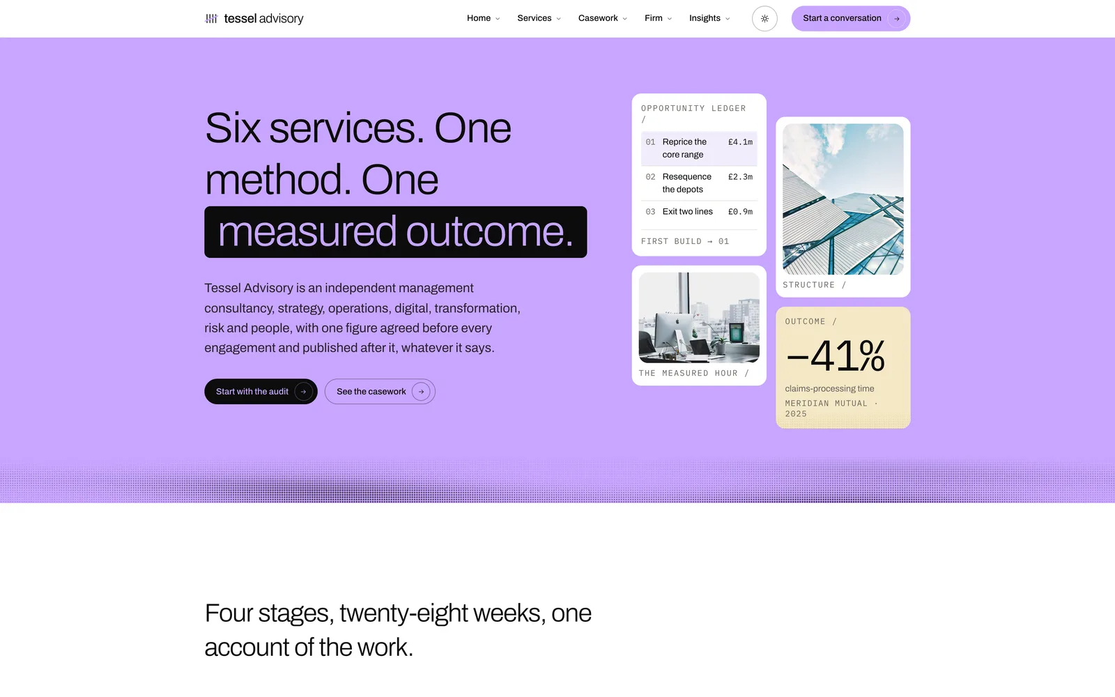
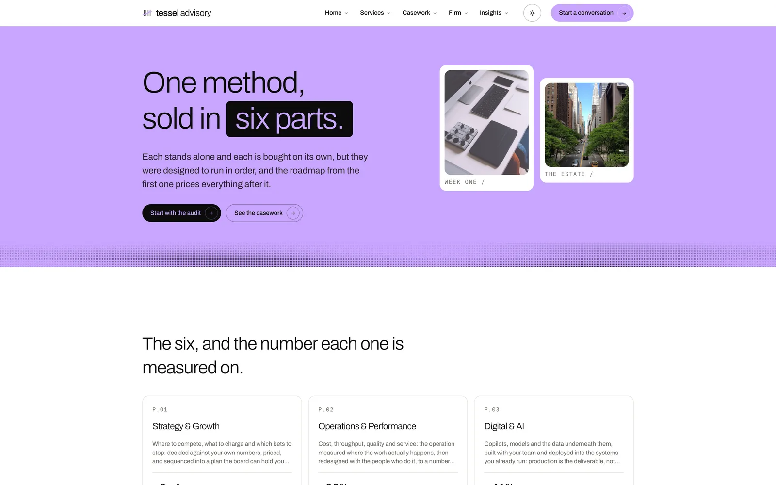
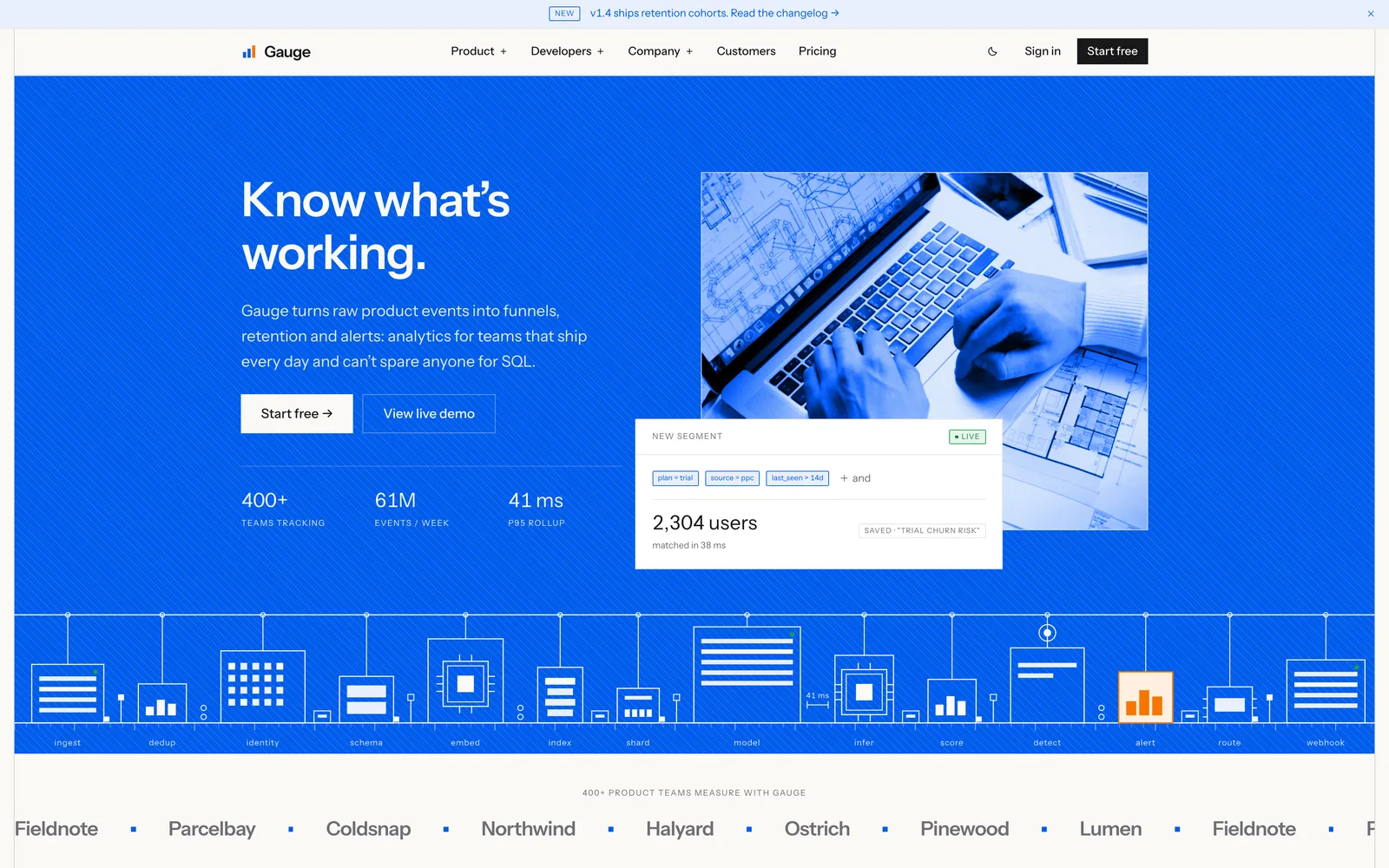
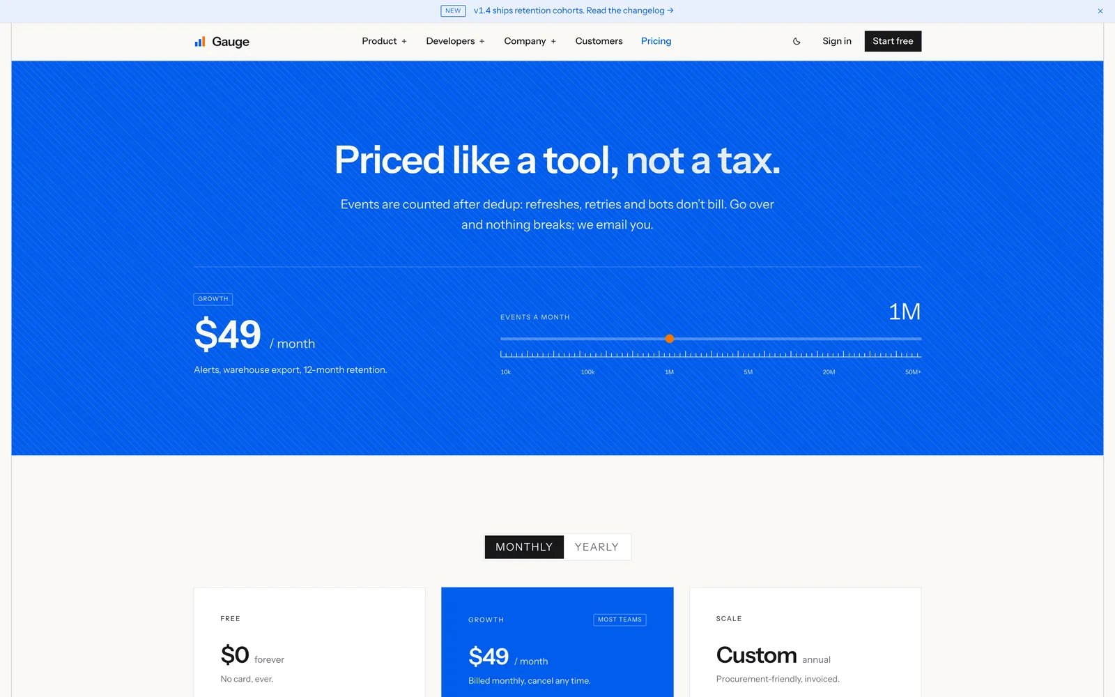
Two columns of covers counter-scrolling, equal distance and opposite directions. It fills itself to twelve tiles rather than trusting the caller — the homepage passed four and left the bottom third of the panel bare. Under prefers-reduced-motion the script never runs and the CSS resting offsets are the whole composition, which is the correct answer rather than a degraded one.

Chrome
The parts every page wears. They are shown here detached from the page so their own states can be seen; on a real page they come from the layout, not from the screen.
Wordmark and MarkTile
The handwritten wordmark in sizes, with and without the descriptor, and the tile: the word's own s, for wherever the word will not fit. Both are drawn from lib/brand/mark.ts, which the favicon, the share cards and the email logo read too. Below 24px the tile's line goes heavier.
AccountLink and AccountMenu
Both decide signed-in state in the browser from a presence cookie that says only THAT somebody is signed in, never who. Reading the real session on the server would make every page dynamic and cost the catalogue and every listing its static render. Nothing is decided on the cookie — /library calls requireUser() for itself. Signed out, which is what you are looking at here, the menu is a plain link.
ThemeToggle and ThemeSwitch
The toggle sits in the navigation: one press, light to dark or back, the old icon turning away as the new one arrives. It is the one component that legitimately carries a dark: class, because it swaps which icon is drawn rather than which colour is used. The switch sits in the footer and adds System, which hands the choice back to the machine. Both go through setTheme, so they always agree, and the page cross-fades rather than flickering. Each half of this pair is a fixed theme, so the switch marks the real choice on both. The phone menu takes the large size: 44px buttons a finger can hit, the switch 48px tall beside the Sign in pill.
Sections
Full-bleed blocks rather than parts. They paint their own background edge to edge, so they are specimened on their own page where a viewport-width thing can be judged at viewport width.
Call-to-action sections
Six shapes for asking — Band, Split, Offer, Inline, Spotlight, Proof — plus the two full sections that came off the homepage. Each carries exactly one lime control; the tone-coloured ones set tone-* on the section and override nothing inside. Illustrations are drawn SVG on the same tokens, so they follow the tone with no variants.
They are not embedded here on purpose: five full-width sections stacked inside a bordered box teaches you how they look inside a bordered box.
Every number in them is a prop
Maintaining this
components/ui/ with every state designed, and onto this page, in the same iteration it is built. Not the next one.